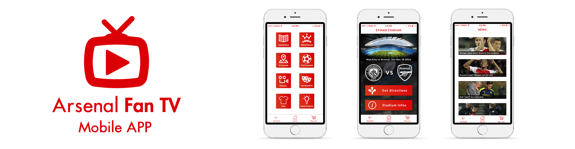
aftv
Designing a mobile app for football fans.
Role: UI/UX designer
Platform: Mobile App iOS
Timeline: 2017
the project:
Arsenal Fan TV is first of all a YouTube channel that started to upload content with fans reactions after the games of the Arsenal FC. It got very popular quickly due to the "raw" footages of the many supporters of the club, giving their takes on the performances, players and staff ratings, predictions and even more. They have a website but wanted to offer even more to the Arsenal FC fans with a new app and many new features specific to the app to really make it a "must have" for the fanbase, and this is where my work started...
the challenge:
Creating an app that is easy to use, but with many and sometimes complexes features. Also designing for a very wide range of users. AFTV being a very popular YouTube channels that provides content for users of all ages (from 14 years old to 50 years old approximately).
DESIGNING THE APP:
So after doing some research and creating user personas.
I realized that, as mentioned above, the AFTV followers /users vary from a very wide range of age (approx. 14 to 50 years old). So the design had to very simple and clear, you don't want to confuse and lose unexperienced users. And at the same time things had to be very clean and well organized, because that's what more experienced users expect and want from football apps.

personas
So to get a better understanding of what the app should offer in terms of usability, features, visual style and more. I started to do some research of potential users to create personas and therefore, know who I was going to design for.

sketches
I started sketching out various ideas to work on some of the most important request I received during the user research and different personas. With ideas for the directions of the stadiums, fixtures and rankings, news of the Arsenal FC.

userflows
After sketching out ideas. I started to do user flows to structure the information and have a better idea of the general user experience. user flows really help to create the user experience by deciding what the user will be able to do with the app and how can he get to specific destinations.

wireframes
Wireframes help to join together the sketches and the user flows. Giving a more advanced idea of what the app will look like visually and on a UX point of view.

Wireframes of the main sections of the app.
ui/visual guidelines
After the wireframes were created, I had a more concrete idea on how the app was going to be designed and structured. I started to work on the visual design of the app. AFTV already has a branding, so I picked the colors they use as main colors to keep the brand continuity (red/white). I went with a minimal design style to keep it clean visually and easier to understand and interact with for the user. Also during and after the design phase of the project, I did some prototyping so i could ask people to try and explore the app. Giving them goals and tasks to achieve and see if they were able to achieve the tasks without confusion or struggles. It helped me notice if there was anything in the design or architecture that had to change or be tweaked. The results were pretty convincing, here is the link to the prototype: https://invis.io/8PBLLJEF6

Visual guidelines and principles that were applied across the app
